Friday, April 23, 2010

DRG


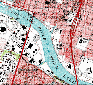
A digital raster graphic (DRG) is a scanned image of a US Geological Survey standard series topographic map.

http://images.google.com/imgres?imgurl=http://www.tceq.state.tx.us/assets/public/gis/images/drg.gif&imgrefurl=http://www.tceq.state.tx.us/gis/drg.html&usg=__qxjL45cP4iIaG2I7U_tRa1wO3Vs=&h=556&w=607&sz=97&hl=en&start=2&um=1&itbs=1&tbnid=XTr5fV2kfCeExM:&tbnh=125&tbnw=136&prev=/images%3Fq%3Ddrg%26um%3D1%26hl%3Den%26client%3Dsafari%26rls%3Den%26tbs%3Disch:1

DLG


A digital line graph (DLG) is a digital vector data representing cartographic information. DLG's contain a wide variety of information depicting geographic features.

http://images.google.com/imgres?imgurl=http://www.dnr.sc.gov/GIS/img/beaufdlg.gif&imgrefurl=http://www.dnr.sc.gov/GIS/descdlg.html&usg=__0pi5BhKiLauGk0s_nvNSQugOHzo=&h=257&w=288&sz=16&hl=en&start=2&um=1&itbs=1&tbnid=Q9saV3NDDRom1M:&tbnh=103&tbnw=115&prev=/images%3Fq%3Ddigital%2Bline%2Bgraph%26um%3D1%26hl%3Den%26client%3Dsafari%26rls%3Den%26tbs%3Disch:1

DEM


A digital elevation model (DEM) is a digital representation of ground surface topography or terrain. A DEM can can be represented as a raster or as a triangular irregular network.

http://images.google.com/imgres?imgurl=http://edc.usgs.gov/images/dem.jpg&imgrefurl=http://lukesmaps.blogspot.com/2008_12_01_archive.html&usg=__3ZngUOOz5PG3ARFDFZsy0lzrST4=&h=846&w=634&sz=204&hl=en&start=2&um=1&itbs=1&tbnid=Y0xo31nJCxFYSM:&tbnh=145&tbnw=109&prev=/images%3Fq%3DDEM%26um%3D1%26hl%3Den%26client%3Dsafari%26sa%3DN%26rls%3Den%26tbs%3Disch:1

DOQQ


Digital Orthophoto Quarter Quads (DOQQ) are digital images produced by the USGS. They contain orthorectified aerial photography at a resolution of 1 meter.

http://images.google.com/imgres?imgurl=http://www.dnr.sc.gov/GIS/images/doqq_ex2006.gif&imgrefurl=http://www.dnr.sc.gov/GIS/descdoqq.html&usg=__dKQ3_dTdeqqIO_rqbqh0yNzyHYI=&h=265&w=225&sz=63&hl=en&start=10&um=1&itbs=1&tbnid=Dt9RTZZd1OocJM:&tbnh=112&tbnw=95&prev=/images%3Fq%3DDOQQ%26um%3D1%26hl%3Den%26client%3Dsafari%26sa%3DN%26rls%3Den%26tbs%3Disch:1

Continuously Variable Proportional Circle Map


A continuous variable proportional circle map is a proportional circle map which utilizes circles to create point data. These circles on the maps are in proportion to the variable being measured. This continuous variable proportional circle map above shows where the major industries are located in western Germany.

http://images.google.com/imgres?imgurl=http://www.lib.utexas.edu/maps/europe/west_germany_ind_1972.jpg&imgrefurl=http://mapanalysisnoles949.blogspot.com/2008/06/continuously-variable-proportional.html&usg=__C11P3mZOyeGNRV9SpdWnWptLQSM=&h=1088&w=762&sz=208&hl=en&start=1&um=1&itbs=1&tbnid=gcVPI-fj1PL89M:&tbnh=150&tbnw=105&prev=/images%3Fq%3DContinuously%2BVariable%2BProportional%2BCircle%2BMap%26um%3D1%26hl%3Den%26client%3Dsafari%26sa%3DN%26rls%3Den%26tbs%3Disch:1

Range Graded Proportional Circle Map


A range graded proportional circle map is a proportional circle map that depicts the circles in relation to ranges of data. This range graded proportional circle map above shows different locations in relation to one another.

http://images.google.com/imgres?imgurl=http://4.bp.blogspot.com/_b_Fy-HKi1ks/STfcbpmgJAI/AAAAAAAAAHw/dEpRC6_r0ko/s320/Range_graded_proportional_circle_map.gif&imgrefurl=http://bpxf20map.blogspot.com/2008_12_01_archive.html&usg=__0mGP8JXqfcw3wK__rS1wYjE8lC8=&h=192&w=320&sz=92&hl=en&start=4&um=1&itbs=1&tbnid=kPO4XwWSPG0QUM:&tbnh=71&tbnw=118&prev=/images%3Fq%3Drange%2Bgraded%2Bproportional%2Bcircle%2Bmap%26um%3D1%26hl%3Den%26client%3Dsafari%26sa%3DN%26rls%3Den%26tbs%3Disch:1

Classed Choropleth Maps


In a classed choropleth maps the main objective is to determine height and shading or color intensity of the bar for each map classed. This involves creating a classed frequency legend including a frequency histogram and shading. As seen in the classed choropleth map above it compares the amounts of hispanics and latinos is Florida. After looking at the data they came to conclusion that most hispanics and latinos live in southern florida.


http://images.google.com/imgres?imgurl=https://blogger.googleusercontent.com/img/b/R29vZ2xl/AVvXsEjMeAbzckMfx_vBcHVMqZPQAejVlYQWhCUosJ0cESscFTRxR4E5dePAjsgO4TFrA-3dBFkT5DUiM8PJ-rQloocFg4plHc_uOj_bSXRSPe5Hs3bTCuNULUrn9EXYmvV059a5HOqdYKw_Kak/s320/classed+choropleth+map.gif&imgrefurl=http://mavance2000.blogspot.com/2008/07/classed-choropleth-map.html&usg=__0rFgtG2hjlZ2rqilp86uSPKaxAU=&h=240&w=320&sz=72&hl=en&start=2&um=1&itbs=1&tbnid=ay-cD1KL1dxxdM:&tbnh=89&tbnw=118&prev=/images%3Fq%3Dclassed%2BChoropleth%2BMaps%26um%3D1%26hl%3Den%26client%3Dsafari%26sa%3DN%26rls%3Den%26tbs%3Disch:1

Unclassed Choropleth Maps


Unclassed proportional maps assigns shadings proportional to the data values so that these choropleth maps do not have to classify the data. This way of mapping usually isn't accepted because many cartographers claim that they lose their ability to communicate.

http://images.google.com/imgres?imgurl=http://www.agocg.ac.uk/reports/visual/casestud/dykes/figure9.gif&imgrefurl=http://www.agocg.ac.uk/reports/visual/casestud/dykes/issue3_1.htm&usg=__acCVS3EXsy9isP2c3sYWctvfaOM=&h=349&w=421&sz=9&hl=en&start=2&um=1&itbs=1&tbnid=z3m-Y2M2TzdcGM:&tbnh=104&tbnw=125&prev=/images%3Fq%3Dunclassed%2BChoropleth%2BMaps%26um%3D1%26hl%3Den%26client%3Dsafari%26sa%3DN%26rls%3Den%26tbs%3Disch:1

Univariate Choropleth Maps


A univariate choropleth map displays a single data set. As you can see on the map above the distribution is a lot smaller on the easter part of the United States.

http://images.google.com/imgres?imgurl=http://people.cas.sc.edu/hardistf/images/univariate_map.jpg&imgrefurl=http://juldyhernandez.blogspot.com/2009_04_01_archive.html&usg=__Il9kHkPdl34IAZxCwGHAjBa_CtU=&h=766&w=1024&sz=223&hl=en&start=1&um=1&itbs=1&tbnid=CGdx03PQfgB1ZM:&tbnh=112&tbnw=150&prev=/images%3Fq%3Dunivariate%2BChoropleth%2BMaps%26um%3D1%26hl%3Den%26client%3Dsafari%26sa%3DN%26rls%3Den%26tbs%3Disch:1

Standardized Choropleth Maps


Data in choropleth maps are standardized to allow comparison of distribution among different areas. The map above shows the different area's population among people of age 14 and above in Canada.

http://images.google.com/imgres?imgurl=http://www.statcan.gc.ca/pub/92f0138m/2008003/figures/figure3.1-en.jpg&imgrefurl=http://www.statcan.gc.ca/pub/92f0138m/2008003/figures/5200001-eng.htm&usg=__LwfMIXP6xqMcKs73DRmozwwQX3g=&h=620&w=850&sz=318&hl=en&start=1&um=1&itbs=1&tbnid=CVFlvJdZBdf_YM:&tbnh=106&tbnw=145&prev=/images%3Fq%3DStandardized%2BChoropleth%2BMaps%26um%3D1%26hl%3Den%26client%3Dsafari%26sa%3DN%26rls%3Den%26tbs%3Disch:1

Unstandardized Choropleth Maps

Unstandardized choropleth maps utilize raw numbers when displayed. In this map that is displayed above shows the race between democrats and republicans in the 2008 presidential election. It is shown above that the democrats won by 40 votes.

http://images.google.com/imgres?imgurl=http://politicalmaps.org/wp-content/uploads/2007/12/2008-prediction-map-11252007.jpg&imgrefurl=http://ashleighsmapcatalog.blogspot.com/2010/03/unstandardized-choropleth-map.html&usg=__F1ItJ8pnMrGB1_RjmVw1GHZMFy0=&h=505&w=756&sz=96&hl=en&start=10&um=1&itbs=1&tbnid=2RFfwAYP9At11M:&tbnh=95&tbnw=142&prev=/images%3Fq%3DUnstandardized%2BChoropleth%2BMaps%26um%3D1%26hl%3Den%26client%3Dsafari%26sa%3DN%26rls%3Den%26tbs%3Disch:1

Nominal Area Choropleth Map

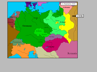
A nominal area choropleth map is a choropleth map that displays nominal data. Here is a map with nominal data of Northern Europe in 1939.

http://images.google.com/imgres?imgurl=http://web.cs.wpi.edu/~matt/courses/cs563/talks/nominal_data/geopolitical.gif&imgrefurl=http://mollysmaps.blogspot.com/2008_10_01_archive.html&usg=__ASBqqtd3Mch6IpoTtTGEJ2b89I4=&h=576&w=776&sz=23&hl=en&start=2&um=1&itbs=1&tbnid=4FW223fnl--3hM:&tbnh=105&tbnw=142&prev=/images%3Fq%3DNominal%2BArea%2BChoropleth%2BMap%26um%3D1%26hl%3Den%26client%3Dsafari%26sa%3DN%26rls%3Den%26tbs%3Disch:1

Accumulative Line Graph


The accumulative line graph or Lorenz Curve graphically represents the cumulative representation the cumulative distribution function of a probability distribution. A Lorenz Curve is used to display income distribution. As you can see above on the accumulative line graph the vertical axes is income and the vertical axes is population.

http://images.google.com/imgres?imgurl=http://www.unc.edu/depts/econ/byrns_web/Art/Glossary/LorenzCurve.jpg&imgrefurl=http://mcatfordummies.blogspot.com/2008/08/accumulative-line-graph-or-lorenz-curve.html&usg=__1yoyIDakWk0DqwwjY_0pYRbLBWA=&h=252&w=252&sz=37&hl=en&start=3&um=1&itbs=1&tbnid=Hj-xgpS4uCWCIM:&tbnh=111&tbnw=111&prev=/images%3Fq%3Daccumulative%2Bline%2Bgraph%26um%3D1%26hl%3Den%26client%3Dsafari%26sa%3DN%26rls%3Den%26tbs%3Disch:1

Index Value Plot


This index value plot helps display current streamflow with historical streamflow for the United States. The index value plot will help show differences between data information.

http://images.google.com/imgres?imgurl=https://blogger.googleusercontent.com/img/b/R29vZ2xl/AVvXsEiYndwgXt-H0vRv1ikLQEfYUGIQSkhrSFBNqB77hB_eGeS9_8aGVGGIrpjcbjiz_j8hZQdtlHHT4I30-Y472gzzyQOwiIOR1Vt4Fz8qpVOb-kLtJ376h-rXabyigajpQljbUM9nFXmFS3s/s320/index+value+plot.gif&imgrefurl=http://mavance2000.blogspot.com/2008/07/index-value-plot.html&usg=__2n27SvHUB_3moyFmL2yHAmqtvtc=&h=262&w=320&sz=51&hl=en&start=1&um=1&itbs=1&tbnid=48P8wB-dzl_PwM:&tbnh=97&tbnw=118&prev=/images%3Fq%3Dindex%2Bvalue%2Bplot%26um%3D1%26hl%3Den%26client%3Dsafari%26sa%3DN%26rls%3Den%26tbs%3Disch:1

Population Profile

Population profile maps present a graphic overview of several demographic statistics collected certain data. They can depict a wide range of variables through different methods. As you can see on the population profile above age distribution is hwon from 1997 and 2005.

http://www.google.com/imgres?imgurl=http://www.mag.maricopa.gov/archive/vv2025/presentations/seg1/seg1-1/img013.JPG&imgrefurl=http://www.mag.maricopa.gov/archive/vv2025/presentations/seg1/seg1-1/sld013.htm&usg=__3RFdXtplyixs9JDSB3YsC8ZrGis=&h=360&w=480&sz=147&hl=en&start=14&itbs=1&tbnid=hGNhFY8U_LqX2M:&tbnh=97&tbnw=129&prev=/images%3Fq%3Dpopulation%2Bprofile%26hl%3Den%26sa%3DG%26tbs%3Disch:1

Triangular Plot

A triangular plot displays information in the shape of a triangle. In this example above the triangle is a plot of election votes from 0-100.

http://www.google.com/imgres?imgurl=https://blogger.googleusercontent.com/img/b/R29vZ2xl/AVvXsEhawyLKBktuq79-TwtLG2jjlxfNriEOO7FNuoWnkJBaF5mL7-W3Q3inJoQQ3ZdoMfZhx0alHB1au0aecyrGmTP0E4nLQ3q7wU0a8IRwuWmQ0COQp5KTCtqXb7S9E00U4azpNZfJ2qfOykQd/s400/triangular+plot.png&imgrefurl=http://kimberlysmappingproject.blogspot.com/2009_04_01_archive.html&h=362&w=382&sz=29&tbnid=4NVWFUzWJ_Tc4M:&tbnh=117&tbnw=123&prev=/images%3Fq%3Dtriangular%2Bplot&usg=__arlmZaqTkzIUxD-Qguuh72QA5XU=&ei=FjXSS-j-IoHa9ATOk4G4Dw&sa=X&oi=image_result&resnum=1&ct=image&ved=0CAYQ9QEwAA

Parallel Coordinate Graph

A parallel coordinate graph obtains multivariate relations. They are used to show numerous amounts of sets of data. Specific properties of the relationship correspond to the geometrical properties of the graph.

http://images.google.com/imgres?imgurl=https://blogger.googleusercontent.com/img/b/R29vZ2xl/AVvXsEiEX-RCfBB0SVX-j4rHPPAFfblXeQ1uRrWRIx8mGpGdFOH_h6bKBfHQn_ebiTKATdGpHj3v6u-81nMMuwAyQnszxtAUDPk4-7hqh1cPiCvb1BOE0UwP0RWUBQkpPfBdglqe0YdgnrS_3Q2N/s320/parallel2.png&imgrefurl=http://weitaiyun.blogspot.com/2009/03/unison-graph-and-parallel-coordinate.html&usg=__xl-_0cUnh8gqsmMkA-pzAgBN-Yk=&h=304&w=320&sz=115&hl=en&start=2&um=1&itbs=1&tbnid=4CSYRreCRvKIEM:&tbnh=112&tbnw=118&prev=/images%3Fq%3Dparallel%2Bcoordinate%2Bgraph%26um%3D1%26hl%3Den%26client%3Dsafari%26sa%3DN%26rls%3Den%26tbs%3Disch:1

Similarity Matrix


A similarity matrix is a matrix of scores which show the similarities between two data points. Similarity matrix's are usually used in sequence alignment. The higher the score the more similar it is. This similarity matrix above has a sequenced alignment that is going from the bottom right to the top left.


http://images.google.com/imgres?imgurl=http://tomcat.esat.kuleuven.be/txtgate/images/distmat.png&imgrefurl=http://tomcat.esat.kuleuven.be/txtgate/tutorial.jsp&usg=__8RIot2zOHeydt2Msr72ulaHhGV0=&h=559&w=455&sz=10&hl=en&start=1&um=1&itbs=1&tbnid=8i8FvcwpEiookM:&tbnh=133&tbnw=108&prev=/images%3Fq%3Dsimilarity%2Bmatrix%26um%3D1%26hl%3Den%26client%3Dsafari%26sa%3DN%26rls%3Den%26tbs%3Disch:1

Bilateral Graph

A bilateral graph depicts increases on one side of a zero line and it decreases on the other side. They are used to display data when there are negative and positive values. On this bilateral graph above it shows how Bush's economic policies effect jobs and unemployment. The bottom line shows how jobs rise and the unemployment rate goes up and on the top line the unemployment rate decreases.


http://images.google.com/imgres?imgurl=http://www.ustreas.gov/press/releases/images/november%2520jobs%2520graph.jpg&imgrefurl=http://kimberlysmappingproject.blogspot.com/2009_04_01_archive.html&usg=__h5piQogeES9nE9OjoBaguGPAOes=&h=512&w=726&sz=74&hl=en&start=4&um=1&itbs=1&tbnid=vFrGJ4PAWDSgiM:&tbnh=99&tbnw=141&prev=/images%3Fq%3Dbilateral%2Bgraph%26um%3D1%26hl%3Den%26client%3Dsafari%26sa%3DG%26rls%3Den%26tbs%3Disch:1

Bivariate Choropleth Map


Bivariate choropleth maps have two different variables that are displayed on one map by including two different sets of symbols or colors. Here is a map of the change in divorce rates from 1980-1990. The number of divorces are shown in color from white to dark green. The most divorce rates occurred in the midwest.

http://images.google.com/imgres?imgurl=http://www.pop.psu.edu/images/gia/maps/changeanim.gif&imgrefurl=http://bmeedermaps.blogspot.com/2008_08_01_archive.html&usg=__nXDp6JgybQs64a-lNuKT_5nqpDw=&h=459&w=594&sz=169&hl=en&start=3&um=1&itbs=1&tbnid=U6xDEMLPyl0ZLM:&tbnh=104&tbnw=135&prev=/images%3Fq%3Dbivariate%2Bchoropleth%2Bmaps%26um%3D1%26hl%3Den%26client%3Dsafari%26sa%3DN%26rls%3Den%26tbs%3Disch:1

Climograph


A climograph is a graphical representation of the monthly precipitation and temperature conditions for a specific region. Precipitation is shown by the bar graph and a line graph depicts temperature. This climograph above shows the precipitation and temperature per month in Walgett, Australia.


http://images.google.com/imgres?imgurl=http://www.uwsp.edu/gEo/faculty/lemke/geog101/images/09_climograph_BSh.gif&imgrefurl=http://www.uwsp.edu/gEo/faculty/lemke/geog101/lecture_outlines/09_global_climate_patterns.html&usg=__YSz6Fe5zGIhXpzQJscVU8pSZv6s=&h=458&w=400&sz=15&hl=en&start=1&um=1&itbs=1&tbnid=UOhYJArUZDVnLM:&tbnh=128&tbnw=112&prev=/images%3Fq%3Dclimograph%26um%3D1%26hl%3Den%26client%3Dsafari%26sa%3DN%26rls%3Den%26tbs%3Disch:1

Correlation Matrix


A correlation matrix lists the variable names down the first column and across the first row. The diagonal of a correlation matrix always consists of ones. In all correlation matrix's there are two triangles that are the values below and to the left of the diagonal and and above and to the right of the diagonal. A correlation matrix is always a symmetric matrix. This correlation matrix above has five groups in each other columns.

http://images.google.com/imgres?imgurl=https://blogger.googleusercontent.com/img/b/R29vZ2xl/AVvXsEirI8zO5KzpFtQB9A7p3cO-1-NDJ1NyXx40WUs77WljP9tXnvC6qANA6Qf5MnYPSyu4Rs6BaxtpIGTMZFUR5zW4Sgb6MFL4Z_HWI2PY3KPlGMPpEnruC6calsaK8UE0F2IGFIbNUN-_T98/s320/correlation%252Bmatrix2.gif&imgrefurl=http://mapilicious.blogspot.com/2009_11_01_archive.html&usg=__IKhCg7pyhfasxlMjwG18RZfxCOc=&h=314&w=320&sz=165&hl=en&start=4&um=1&itbs=1&tbnid=tYqkjioDJj0cOM:&tbnh=116&tbnw=118&prev=/images%3Fq%3Dcorrelation%2Bmatrix%26um%3D1%26hl%3Den%26client%3Dsafari%26sa%3DN%26rls%3Den%26tbs%3Disch:1

Scatterplot


This scatterplot above uses Cartesian coordinates to display values for two variables from a given set of data. The data is then displayed as a collection of points with each having the value of a variable determining the position of the horizontal axes and other variables determining the position on the vertical axes. On the scatterplot above the vertical axes if the wife's age and the horizontal axes is the husbands age. The collection of points is positive considering it is moving up and to the right.


http://images.google.com/imgres?imgurl=http://www.mzandee.net/~zandee/statistiek/stat-online/chapter4/graphics/age_scatterplot.gif&imgrefurl=http://www.mzandee.net/~zandee/statistiek/stat-online/chapter4/pearson.html&usg=__914qCRxxlhsZIPs0iySmpD34iRY=&h=350&w=385&sz=5&hl=en&start=1&um=1&itbs=1&tbnid=nOUtkebkMbVnJM:&tbnh=112&tbnw=123&prev=/images%3Fq%3Dscatterplot%26um%3D1%26hl%3Den%26client%3Dsafari%26sa%3DN%26rls%3Den%26tbs%3Disch:1

Windrose

A windrose is a graphical tool utilized by meteorologists to depict how wind speed and direction are distributed at a specific location. It will show the frequency of winds blowing from certain directions. Each concentric circle stands for a different frequency which starts at zero in the center and increases in frequency in the outer circles. This windrose above shows the speed of wind and its directions.


http://images.google.com/imgres?imgurl=http://anggun3.files.wordpress.com/2008/03/463px-wind_rose_plot.png&imgrefurl=http://anggun3.wordpress.com/2008/03/13/wind-rose/&usg=__FIRzt0nIWFMEhzk1_DhqrnGtS80=&h=599&w=463&sz=67&hl=en&start=16&um=1&itbs=1&tbnid=HIjgkf-RmU-bxM:&tbnh=135&tbnw=104&prev=/images%3Fq%3Dwindrose%26um%3D1%26hl%3Den%26client%3Dsafari%26sa%3DN%26rls%3Den%26tbs%3Disch:1

Stem and Leaf Plot


Stem and leaf plot is a way to show quantitative data in a graphical format to help visualize the distribution among categories. To construct a stem plot, the observations must first be sorted in ascending order. As seen above this stem and leaf plot shows the ages of the people at a family reunion with the stems on the left and the leafs on the right.

http://images.google.com/imgres?imgurl=http://www.eduplace.com/math/mhm/5/06a/ts_5_6a_wi-1.gif&imgrefurl=http://www.eduplace.com/math/mhm/5/06a/index.html&usg=__2ehQfQBpEn5_Elz1d1fNoam2NCc=&h=267&w=235&sz=5&hl=en&start=3&um=1&itbs=1&tbnid=uSXivEv81o_H6M:&tbnh=113&tbnw=99&prev=/images%3Fq%3DStem%2Band%2Bleaf%2Bplot%26um%3D1%26hl%3Den%26client%3Dsafari%26sa%3DN%26rls%3Den%26tbs%3Disch:1

Histogram


A histogram is a graphical display of tabulated frequencies. It shows you what proportion of cases fall into each of several categories. There is a difference between a histogram and a bar chart in the sense that it is the area of the bar that indicates the value, not the height, which is a huge difference when the variables aren't at the same width. This histogram above shows the distributions of jockeys.

http://images.google.com/imgres?imgurl=http://www.daisy2000.com/Daisy2003/HorizontalHistogram.gif&imgrefurl=http://lukesmaps.blogspot.com/2008_12_01_archive.html&usg=__agW_ci3rFiJu7i_tRlWK1PX7_hg=&h=600&w=600&sz=13&hl=en&start=5&um=1&itbs=1&tbnid=lFBZFa8ryv6pkM:&tbnh=135&tbnw=135&prev=/images%3Fq%3Dhistogram%26um%3D1%26hl%3Den%26client%3Dsafari%26sa%3DN%26rls%3Den%26tbs%3Disch:1

Box Plot


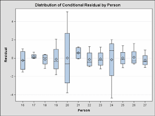
Box plots are very useful to graph groups of numerical data through their five number summaries. Box plots were invented in in 1977 by John Tukey. They are also used to depict differences in populations without making assumptions on statistical distributions. If you look at the box plot above it shows the distribution of conditional residual by person.


http://images.google.com/imgres?imgurl=http://support.sas.com/rnd/base/topics/statgraph/proctemplate/images/boxplot.gif&imgrefurl=http://support.sas.com/rnd/base/topics/statgraph/proctemplate/a002650843.htm&usg=__usY2F0JdhgBukAmpnzVku2XwZjM=&h=300&w=400&sz=11&hl=en&start=14&um=1&itbs=1&tbnid=VP15UM5fsOpSGM:&tbnh=93&tbnw=124&prev=/images%3Fq%3Dbox%2Bplot%26um%3D1%26hl%3Den%26client%3Dsafari%26sa%3DN%26rls%3Den%26tbs%3Disch:1

Star Plot


A star plot is a graphical data analysis method used for examining the relative behavior of all variables in a multivariate data set. This star plot above is of crime rates in the United States. As you can see from this data set Hartford is the smallest crime rate and Los Angeles is the largest.

http://images.google.com/imgres?imgurl=http://www.math.yorku.ca/SCS/Gallery/images/starcrim2.gif&imgrefurl=http://www.math.yorku.ca/SCS/Gallery/milestone/sec8.html&usg=__f5iJmaFMjSPZ2aUhvJIMQp-hgy4=&h=505&w=504&sz=9&hl=en&start=5&um=1&itbs=1&tbnid=HjdhiticvsQY5M:&tbnh=130&tbnw=130&prev=/images%3Fq%3DStar%2BPlots%26um%3D1%26hl%3Den%26client%3Dsafari%26sa%3DN%26rls%3Den%26tbs%3Disch:1

Cartographic Animations


Cartographic animation has become a useful technique for representing geographical areas because of its capabilities to show relations between geospatial data's components, location, attribute, and time. They are usually used to display geospatial information. Its goal is to be able to visualize something that would not be seen if the maps were looked at individually. The map above shows the amount of deaths in Nebraska caused by cancer. This cartographic animation displays the amount of cancer throughout the state.

http://images.google.com/imgres?imgurl=http://maps.unomaha.edu/AnimArt/ActiveLegend/JavaScript/Cancer1.gif&imgrefurl=http://maps.unomaha.edu/AnimArt/ActiveLegend/Peterson.html&usg=__ovflqkuHE_19rW291SackxM2nQk=&h=401&w=640&sz=39&hl=en&start=2&um=1&itbs=1&tbnid=EqcIqbx9G3y8DM:&tbnh=86&tbnw=137&prev=/images%3Fq%3Dcartographic%2Banimations%26um%3D1%26hl%3Den%26client%3Dsafari%26sa%3DN%26rls%3Den%26tbs%3Disch:1

Infrared Aerial Photo


Infrared film is sensitive to a certain spectrum of light. It can be used to document changes in the environment and track various applications. Infrared aerial photography is a powerful tool and not only can be used to document changes to the environment and but also the health of forests and wetlands. This infrared aerial view shows the above shot of a particular city.

http://www.google.com/imgres?imgurl=http://www.fas.org/irp/imint/docs/rst/Sect10/originals/Fig10_7.gif&imgrefurl=http://www.fas.org/irp/imint/docs/rst/Sect10/Sect10_1.html&h=426&w=328&sz=156&tbnid=SaxoXS6VVZVb8M:&tbnh=256&tbnw=197&prev=/images%3Fq%3Dinfrared%2BAerial%2BPhoto&usg=__Om_KY_bB_zrf_Wk4AlJYmBoo1Mw=&ei=_xPSS-3lBY6C8wS0o7S6Dw&sa=X&oi=image_result&resnum=2&ct=image&ved=0CAkQ9QEwAQ

Black and White Aerial Photo


In an infrared photograph, the film or image sensor used is sensitive to infrared light. When filters are used with together with infrared-sensative film or sensors. Black and white images with a lurid appearance known as the "Wood Effect" are caused by foliage and can give "in-camera effects." This black and white aerial photo shows the way the interstate intertwines with one another almost giving it a "dreamy effect."

http://images.google.com/imgres?imgurl=http://www.math.toronto.edu/~drorbn/Gallery/KnottedObjects/Interchange/BWPositive.jpg&imgrefurl=http://andr1587-mapcatalog.blogspot.com/2008_08_01_archive.html&usg=__Wg0J2oFLbmQ4rljqLJMz_8ZL0j4=&h=1968&w=1896&sz=392&hl=en&start=4&um=1&itbs=1&tbnid=K0XmNH_kVEvn3M:&tbnh=150&tbnw=145&prev=/images%3Fq%3DBlack%2Band%2BWhite%2BAerial%2BPhoto%26um%3D1%26hl%3Den%26client%3Dsafari%26sa%3DN%26rls%3Den%26tbs%3Disch:1

Doppler Radar


Doppler Radar is a device that makes use of the doppler effect to produce data of objects that are at a distance. It beams a microwave signal towards a desired target and listening for its reflection. It then analyzes how the original signal has been altered by the objects that reflected it. The doppler effect is the change in a frequency of a wave for an observer moving relative to the source of waves. Doppler refers to the principle the Austrian scientist Christian Doppler discovered in 1842. Doppler worked out his ideas using sound waves, long before radio, much less radar, was invented. As you look at the Doppler Radar above you can see the radar image from the National Weather Service. It shows that there is a major storm around the Orlando area and is moving north west at about 40 DBZ's.

http://images.google.com/imgres?imgurl=http://www.weatherusa.net/blog/images/doppler-orlando-1943.gif&imgrefurl=http://www.weatherusa.net/blog/index.php%3Fmonth%3DAugust_2004&usg=__amiyWLxk0F-njvBo88N6JATaizQ=&h=620&w=620&sz=51&hl=en&start=3&um=1&itbs=1&tbnid=-lqo28ggXCXHhM:&tbnh=136&tbnw=136&prev=/images%3Fq%3Ddoppler%2Bradar%26um%3D1%26hl%3Den%26client%3Dsafari%26sa%3DN%26rls%3Den%26tbs%3Disch:1

LIDAR


LIDAR (Light Detection and Ranging) is a remote sensing technology that measures different properties of dispersed light to find range or other information of a distant target. The difference between lidar and radar is that lidar uses shorter wavelengths of the electromagnetic spectrum. This LIDAR Map above shows the dispersed light throughout.

http://images.google.com/imgres?imgurl=http://www.infomine.com/graphics/suppliers/LiDAR/Mapping.jpg&imgrefurl=http://www.infomine.com/index/suppliers/LiDAR_Services_International.html&usg=__SJkN67qcfnv_SU6hkBjQybQ5gSQ=&h=418&w=506&sz=105&hl=en&start=6&um=1&itbs=1&tbnid=iaMhuhQCFMGp2M:&tbnh=108&tbnw=131&prev=/images%3Fq%3DLIDAR%2Bmap%26um%3D1%26hl%3Den%26client%3Dsafari%26rls%3Den%26tbs%3Disch:1

Statistical Map


Statistical Maps are used to display the distribution of a certain variable over a geographic area. In these maps each unit is represented by a shading technique or color that represents a value. These statistics on these maps are expressed as rates, ratio, percentages, or other measures. The variation in quantity of factor such as rainfall, population, or crops in a geographic area is indicated. The Statistical Map above shows the distribution of people using the internet in Northern Africa. As you can see most of the internet use comes from Egypt and Saudi Arabia.

http://images.google.com/imgres?imgurl=http://www.arabdev.org/images/HowManyOnline.jpg&imgrefurl=http://www.arabdev.org/map&usg=__hJMgWMyG70jPrIHrsRg3DfdS6pQ=&h=346&w=604&sz=31&hl=en&start=1&um=1&itbs=1&tbnid=A2d5fF5ksUaUOM:&tbnh=77&tbnw=135&prev=/images%3Fq%3DStatistical%2Bmap%26um%3D1%26hl%3Den%26client%3Dsafari%26sa%3DN%26rls%3Den%26tbs%3Disch:1

Cartogram

A cartogram is a map where area is not preserved. They are used many of times to represent the size of populations relative to the area in which they inhabit. There are two main types of cartograms: area and distance. An area cartogram illustrates the relative sizes of the populations of the countries by scaling the areas of each country in proportion to its population. Distance cartograms are used to show relative travel times and directions from verticals in a network. The Cartogram map above shows the distribution of the populations in the United States.

http://images.google.com/imgres?imgurl=http://politicalmaps.org/wp-content/uploads/2007/11/2-2004-population-cartogram.png&imgrefurl=http://politicalmaps.org/2004-presidential-election-maps/&usg=__G5oVLyRaf1AbdRTD20IXI70viWo=&h=302&w=476&sz=34&hl=en&start=4&um=1&itbs=1&tbnid=WANMKpYv8-Rw4M:&tbnh=82&tbnw=129&prev=/images%3Fq%3DCartograms%26um%3D1%26hl%3Den%26client%3Dsafari%26sa%3DN%26rls%3Den%26tbs%3Disch:1

Flow Map


Cartographers use flow maps to show the movement of objects from one location to another. These types of maps are easier to read due to merged edges and are uses frequently when depicting migrations. Flow maps can indicate things like what it is that flows, moves, migrates. What direction the flow is moving and what the source and destination is. Also it can show how much is flowing, being transferred, and transported. This map above is a map of Texas and shows the total combined truck flows in 1998. There is two different categories which are network flows and state to state flows. The map shows that most of the flow is through the eastern part of the United States even though there is a significant amount leaving Texas towards the western parts.

http://images.google.com/imgres?imgurl=http://www.lib.utexas.edu/maps/texas/combtrk_tx_1998.jpg&imgrefurl=http://www.lib.utexas.edu/maps/texas.html&usg=__lmhw0Vs7CBL3vJcLJjMnz-NcuNg=&h=524&w=723&sz=194&hl=en&start=4&um=1&itbs=1&tbnid=SlE37CWJGyVCEM:&tbnh=101&tbnw=140&prev=/images%3Fq%3DFlow%2Bmap%26um%3D1%26hl%3Den%26client%3Dsafari%26sa%3DN%26rls%3Den%26tbs%3Disch:1

Isoline Map

This is an Isoline Map which is a map with continuous lines joining points of the same value. They are maps that are a two dimensional representation of a three dimensional model. An isoline map gives you a picture of the concentration of people. The map above shows you the surface dew point temperature which is extremely warm in the south eastern part of the United States.

http://images.google.com/imgres?imgurl=https://blogger.googleusercontent.com/img/b/R29vZ2xl/AVvXsEhV90Q_BmgW12qKKTbCfETrRb4Ti8vtDK1YB1n7y1O9rahtrJO7qmhCUr4pxMkEN_dgoV0ZBb9gV9k_ktHr3enOiI-qN0GXutOKx3IfieYDURVBkhhxHV_CQ2uOw_cBpoMI62y6-zhpsdhT/s400/Isoline.gif&imgrefurl=http://mikesmaps.blogspot.com/&usg=__-IuYs3f3ZHdIgnFzl_CezIXlKww=&h=320&w=400&sz=121&hl=en&start=3&um=1&itbs=1&tbnid=LdfNxBQp6zAeCM:&tbnh=99&tbnw=124&prev=/images%3Fq%3Disoline%2Bmaps%26um%3D1%26hl%3Den%26client%3Dsafari%26sa%3DN%26rls%3Den%26tbs%3Disch:1

Proportional Circle Maps

This is a Proportional Circle Map that displays data in relation to the size of the circles. In this map data is displayed of internet users in Europe. As you can see from this map above most of the population that uses the internet comes from western Europe while there is little use of the internet in the eastern parts.

http://images.google.com/imgres?imgurl=http://jeffhobbs.files.wordpress.com/2008/03/1.gif&imgrefurl=http://mapanalysisnoles949.blogspot.com/2008/06/proportional-circle-map.html&usg=__DsC9Ei88pwg8XwnNDz7gIIPkAf8=&h=554&w=738&sz=146&hl=en&start=6&um=1&itbs=1&tbnid=MieCmGUTcqymAM:&tbnh=106&tbnw=141&prev=/images%3Fq%3Dproportional%2Bcircle%2Bmaps%26um%3D1%26hl%3Den%26client%3Dsafari%26sa%3DN%26rls%3Den%26tbs%3Disch:1

Choropleth Maps

This is a Choropleth Map which shows the use of domestic freshwater including withdrawals and deliveries in 1990. A choropleth map is a thematic map in which areas are shaded or patterned in proportion to the measurement of the statistical variable being displayed on the map. A choropleth map provides and easy way to visualize how a measurement varies across a geographic area or it shows the level of variability within a region. As seen from the map above most of the freshwater use in 1990 came from the states that are by the water including Florida, California, Texas, Illinois, and New York. Most of the north western part of the United States used little amounts of freshwater while Vermont and Alaska used the least of all of them.


http://images.google.com/imgres?imgurl=http://water.usgs.gov/watuse/graphics/domap.st2.color.gif&imgrefurl=http://rkcartboggle.blogspot.com/2007/11/color-choropleth-map_15.html&usg=__PV3eW3hqIpM6i1PgKxpBiD13WDs=&h=414&w=450&sz=15&hl=en&start=12&um=1&itbs=1&tbnid=2vR5mfpGbek1wM:&tbnh=117&tbnw=127&prev=/images%3Fq%3Dchoropleth%2Bmaps%26um%3D1%26hl%3Den%26client%3Dsafari%26sa%3DN%26rls%3Den%26tbs%3Disch:1

Dot Distribution Map

This map above is a Dot Distribution Map and displays the numerous amounts of Walmart's throughout the United State and how it is turning into a virus. Dot Distribution Maps are useful to help show populations and portray quantitative data as a dot which represents a number of a phenomenon found within the boundary of a geographic area. The pattern of these dots shows the general locations where the phenomenon was most likely to happen. The pattern and number of these dots shows its density. As you can see from this map Walmart has expanded rapidly in the eastern part of the United States and is starting to build many of its stores in western USA. You can see that the dots are more dense in the south eastern part of the United States which shows the viewer that Walmart feels like most of there customers live in this region.

http://images.google.com/imgres?imgurl=http://earthfirst.com/wp-content/uploads/2008/07/walmart-virus.jpg&imgrefurl=http://daniellemapcatalog.blogspot.com/2008_11_01_archive.html&usg=__erghgPEWYNm3mEs5M9KenRBAUm0=&h=321&w=520&sz=74&hl=en&start=9&um=1&itbs=1&tbnid=60htEjAJ4YlW2M:&tbnh=81&tbnw=131&prev=/images%3Fq%3Ddot%2Bdistribution%2Bmaps%26um%3D1%26hl%3Den%26client%3Dsafari%26sa%3DN%26rls%3Den%26tbs%3Disch:1

Propaganda Map


http://images.google.com/imgres?imgurl=http://go.owu.edu/~jbkrygie/krygier_html/geog_222/geog_222_lo/geog_222_lo17_gr/peterspostcard.jpg&imgrefurl=http://go.owu.edu/~jbkrygie/krygier_html/geog_222/geog_222_lo/geog_222_lo16.html&usg=__NMSeAf9B_napzE4-gnV7hVo6yDg=&h=335&w=505&sz=147&hl=en&start=6&um=1&itbs=1&tbnid=KAD0BaGURro6KM:&tbnh=86&tbnw=130&prev=/images%3Fq%3Dpropaganda%2Bmaps%26um%3D1%26hl%3Den%26client%3Dsafari%26sa%3DN%26rls%3Den%26tbs%3Disch:1

PLSS Map

This Public Land Survey System (PLSS) Map is used to subdivide and describe land in the United States. The PLSS is used to divide public domain lands, which are owned by the Federal Government for the benefit of the citizens of the United States. The PLSS divides land into 6-mile-square townships. As you can see from the map above it is drawn into a 6-square township and shows the exact meridians and base lines.

http://images.google.com/imgres?imgurl=http://gis.nwcg.gov/giss_2006/job_aids/maps_and_graphics/USA_PLSS_Meridians_map.jpg&imgrefurl=http://gis.nwcg.gov/giss_2006/cd_contents.html&usg=__6fwSrzU16-Z48U9DJZUVEjApsv8=&h=1095&w=1595&sz=812&hl=en&start=1&um=1&itbs=1&tbnid=kcYAKM5FpuL4SM:&tbnh=103&tbnw=150&prev=/images%3Fq%3DPLSS%2Bmaps%26um%3D1%26hl%3Den%26client%3Dsafari%26sa%3DN%26rls%3Den%26tbs%3Disch:1

Cadastral Map

This is a cadastral map which shows the boundaries and ownership of land parcels. Cadastral Maps are designed to make local situations tangible to an outsider and at the same time change reality. As you can see from this map each portion of the land is given its own boundary and clarifies exactly whose land is whose.

http://images.google.com/imgres?imgurl=http://www.dgs-gis.cz/images/bigones/katastralni.jpg&imgrefurl=http://www.dgs-gis.cz/mapy.php&usg=__UaAjA86QgoqQkHZtgXoGT-Km1Wk=&h=779&w=966&sz=224&hl=en&start=7&um=1&itbs=1&tbnid=vpRTHzlqQCqVyM:&tbnh=119&tbnw=148&prev=/images%3Fq%3DCadastral%2BMaps%26um%3D1%26hl%3Den%26client%3Dsafari%26sa%3DN%26rls%3Den%26tbs%3Disch:1

Thematic Map

This is a Thematic Map of the United States. A Thematic Map is a type of map or chart that is designed to show a particular theme connected with a specific geographic area. These maps are a great resource to get cartographical information on various themes. This is a Thematic Map which shows the population percent change from 1990-1996. As you can see most of the western part of the United States has changed drastically along with Florida and Georgia. There has been little change in the northern eastern part of the United States.

http://www.google.com/imgres?imgurl=http://www.sou.edu/Geography/JONES/GEOG280/stpop96.GIF&imgrefurl=http://tamibeikelboom.blogspot.com/2008/12/thematic-map.html&h=354&w=468&sz=17&tbnid=rhESZkvCQ021-M:&tbnh=97&tbnw=128&prev=/images%3Fq%3DThematic%2Bmap&usg=__GzAey9lrh1Ydrl0GI6wBNGl_qHM=&ei=V_PRS7b9FIv69ASR0cWxDw&sa=X&oi=image_result&resnum=2&ct=image&ved=0CAsQ9QEwAQ

Mental Map

This is a mental map on Boston, Massachusetts. A mental map is a persons perception of the world. It is an individuals own internal map of their own world. This map portrays how someone that lives in Boston would mentally view the city onto a piece of paper. This mental map of Boston is a map that is created in someones mind.

http://images.google.com/imgres?imgurl=http://ocw.mit.edu/ans7870/MAS/MAS.965/f04/assignments/tripti/Assignment10/MyMap.jpg&imgrefurl=http://ocw.mit.edu/ans7870/MAS/MAS.965/f04/assignments/tripti/Assignment10/index.htm&usg=__P2UyeaWUQqBYWpw03xDD_QTTfvQ=&h=437&w=600&sz=79&hl=en&start=6&um=1&itbs=1&tbnid=r97szmc3HSM4BM:&tbnh=98&tbnw=135&prev=/images%3Fq%3DMental%2BMap%26um%3D1%26hl%3Den%26client%3Dsafari%26sa%3DN%26rls%3Den%26tbs%3Disch:1

Isopleths


This is an Isopleth Map which generalizes and simplifies data with a continuous distribution. An isopleth is a line drawn on a map through all points of equal value of some measurable quantity. This map shows the hydrogen ion concentration of made at field laboratories. As shown on the map the ph is a lot higher on the western part of the US and extremely low in the north eastern part.

http://images.google.com/imgres?imgurl=https://blogger.googleusercontent.com/img/b/R29vZ2xl/AVvXsEhxvGAlWCP5nxoxkPIPf1Ccr09uESVflT0omLjQWjD3OKyxRg6WCMvV25SjELE_yIjniyhPTJCLvzAiuIgZ_2e_shT_BJQlgw1euo_3TSf6HcveS93AG56PaWCpmBLBKr1zFFWC_M8u8Sbj/s400/isopleths.gif&imgrefurl=http://kimberlysmappingproject.blogspot.com/2009_04_01_archive.html&usg=__r-6UZq6K-GMzabRhk1_bA4WgLa4=&h=307&w=400&sz=149&hl=en&start=1&um=1&itbs=1&tbnid=LB3-6T1SE6b9AM:&tbnh=95&tbnw=124&prev=/images%3Fq%3Disopleths%26um%3D1%26hl%3Den%26client%3Dsafari%26sa%3DN%26rls%3Den%26tbs%3Disch:1

Isobars


This is an Isobar map which shows the air pressure. Isobars are lines drawn on a weather map connecting points of equal pressure. As you can see from this map of the United States different areas get more pressure than others.

http://images.google.com/imgres?imgurl=http://www.uwlax.edu/faculty/skala/Image58.gif&imgrefurl=http://www.uwlax.edu/faculty/skala/Air-Pressure.htm&usg=__ffISsJydQrKSHMIPa9p0uuTy9fY=&h=650&w=900&sz=29&hl=en&start=1&um=1&itbs=1&tbnid=C45iMAmp8OCR9M:&tbnh=105&tbnw=146&prev=/images%3Fq%3Disobar%2Bmap%26um%3D1%26hl%3Den%26client%3Dsafari%26sa%3DN%26rls%3Den%26tbs%3Disch:1
Isotachs


This map is an Isotach and displays the wind speed. An Isotach is a line on a weather map or chart connecting points where winds of equal speeds have been recorded. As you can see from this map these lines connect equal amounts of wind speed ranging from 100 to 9720.

http://images.google.com/imgres?imgurl=http://www.atmos.washington.edu/~mcmurdie/oct96/isotach_height_300.gif&imgrefurl=http://www.atmos.washington.edu/~mcmurdie/oct96/oct96_labs.html&usg=__7Jjql9-4JoGF2aCurJFUfJIrVKU=&h=748&w=1098&sz=60&hl=en&start=4&um=1&itbs=1&tbnid=IA1tk6Pm6PEHiM:&tbnh=102&tbnw=150&prev=/images%3Fq%3DIsotachs%26um%3D1%26hl%3Den%26client%3Dsafari%26sa%3DN%26rls%3Den%26tbs%3Disch:1

Isopachs

This is an Isopach Map which shows thew rock or sediment thickness. It displays the strategic thickness of a rock unit as opposed to the true vertical thickness. This map contains contour lines of equal thickness over an area. As you can see from this map the thickness of the sediment decreases the further away you go from the land. Close to the land the thickness is around 875 and deep into the ocean its at 250.

http://images.google.com/imgres?imgurl=http://republicenergy.com/Articles/Barnett_Shale/Isopach_Barnett_Shale.jpg&imgrefurl=http://juldyhernandez.blogspot.com/2009_04_01_archive.html&usg=__Ng1tToQ3H8lBOtL0DE-h4c6UigA=&h=686&w=450&sz=117&hl=en&start=3&um=1&itbs=1&tbnid=CS9PwRnd876tjM:&tbnh=139&tbnw=91&prev=/images%3Fq%3DIsopachs%26um%3D1%26hl%3Den%26client%3Dsafari%26sa%3DN%26rls%3Den%26tbs%3Disch:1

Isohyets


This Isohyet map shows the rainfall in Tasmania. As you can see from the map there is little rainfall in the eastern part of Tasmania but the western part of it averages nearly 3,000 millimeters of rainfall annually. The airflow from the Southern Ocean is moisture-laden. When it rises over the western, central, and southern highlands it releases its moisture as rain. As the air flow reaches the eastern parts it has already reduced most of its moisture, and the chance of rain is reduced dramatically. As you can see there is a drastic difference in average cloudiness and rainfall.

http://images.google.com/imgres?imgurl=http://soer.justice.tas.gov.au/2009/image/277/ilw/id277-m-rainfallisohyets-l.gif&imgrefurl=http://soer.justice.tas.gov.au/2009/image/277/index.php&usg=__AeNZAQ1hFEjqGaGXf7c3wcIri7o=&h=697&w=699&sz=27&hl=en&start=4&um=1&itbs=1&tbnid=1FUK3lEmlyEZjM:&tbnh=139&tbnw=139&prev=/images%3Fq%3Disohyets%26um%3D1%26hl%3Den%26client%3Dsafari%26sa%3DN%26rls%3Den%26tbs%3Disch:1