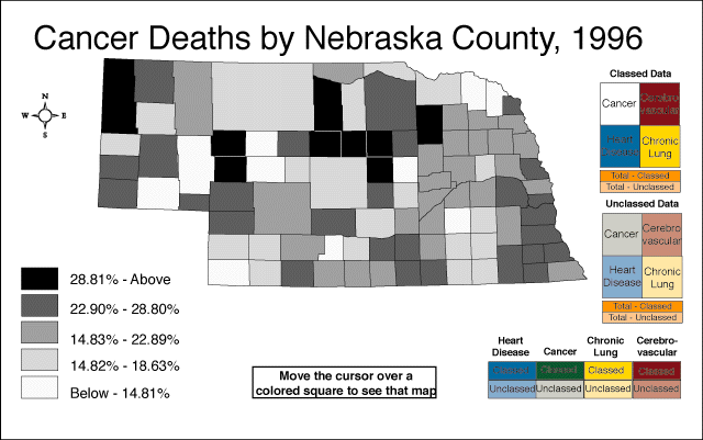
Cartographic animation has become a useful technique for representing geographical areas because of its capabilities to show relations between geospatial data's components, location, attribute, and time. They are usually used to display geospatial information. Its goal is to be able to visualize something that would not be seen if the maps were looked at individually. The map above shows the amount of deaths in Nebraska caused by cancer. This cartographic animation displays the amount of cancer throughout the state.
http://images.google.com/imgres?imgurl=http://maps.unomaha.edu/AnimArt/ActiveLegend/JavaScript/Cancer1.gif&imgrefurl=http://maps.unomaha.edu/AnimArt/ActiveLegend/Peterson.html&usg=__ovflqkuHE_19rW291SackxM2nQk=&h=401&w=640&sz=39&hl=en&start=2&um=1&itbs=1&tbnid=EqcIqbx9G3y8DM:&tbnh=86&tbnw=137&prev=/images%3Fq%3Dcartographic%2Banimations%26um%3D1%26hl%3Den%26client%3Dsafari%26sa%3DN%26rls%3Den%26tbs%3Disch:1
No comments:
Post a Comment